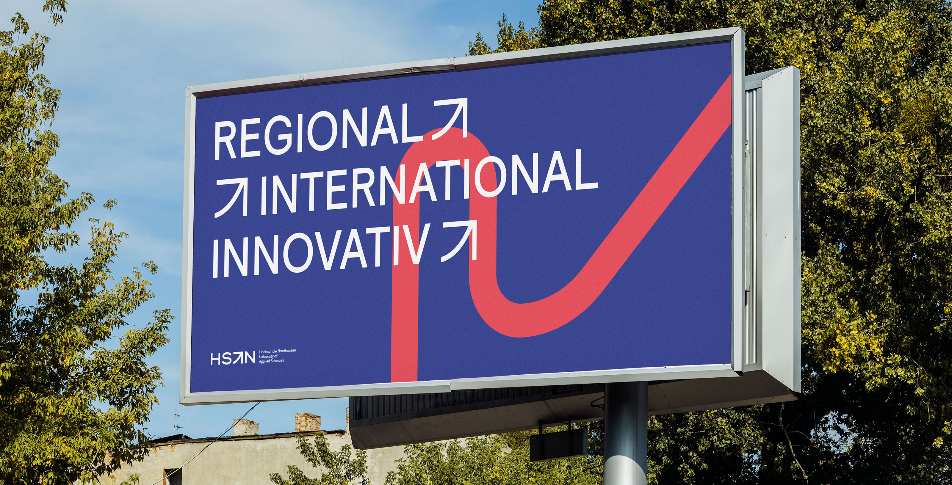
Hochschule Nordhausen – University of Applied Sciences is a small but distinctive university located in the green heart of Thuringia, Germany.
Founded in 1997, the university offers around 2,200 students a highly personalised, practice-oriented education in a both intimate and international environment. With its dynamic campus culture, innovative degree programs, and close-knit community, Hochschule Nordhausen supports students in both academic and personal growth.
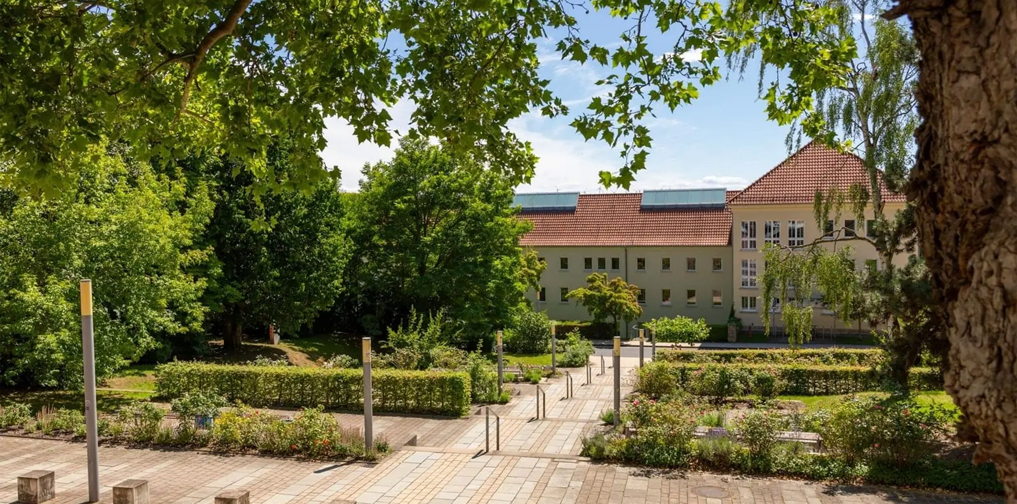
One of the buildings of Hochschule Nordhausen representing its green campus.
To create a fundamentally modernised appearance for Hochschule Nordhausen, the design approach focussed on creating a distinctive and flexible visual system.
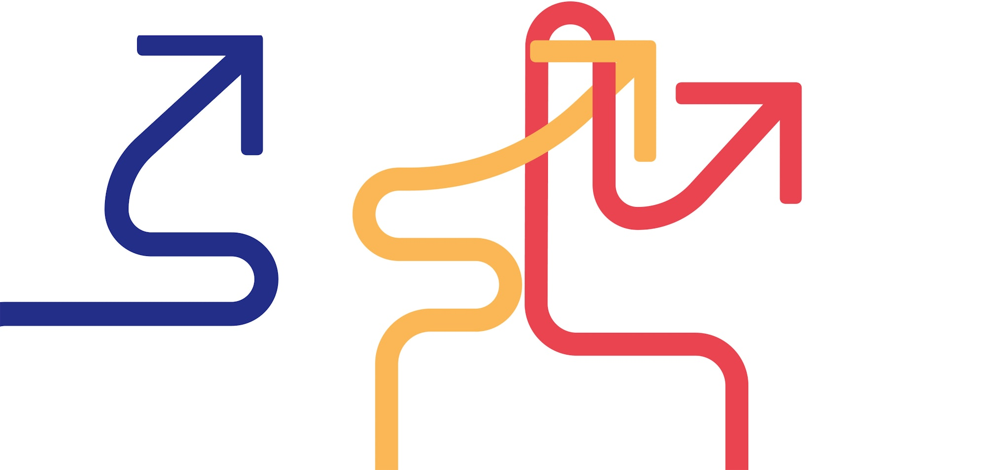
The dynamic qualities of the university were embodied through a custom arrow symbol representing orientation and movement, supported by a bold new color palette and a modular logo system that ensures strong brand recognition across diverse communication channels.
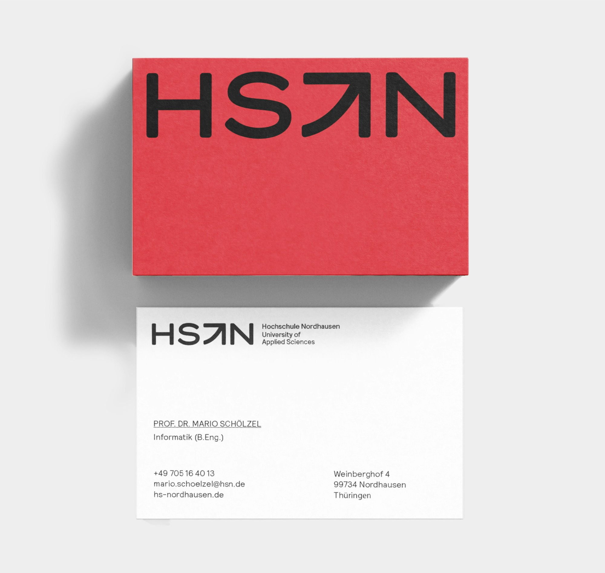
The arrow is the graphic symbol for orientation – its shape indicates the direction and is the opposite of standstill or stagnation; instead, it embodies dynamism.
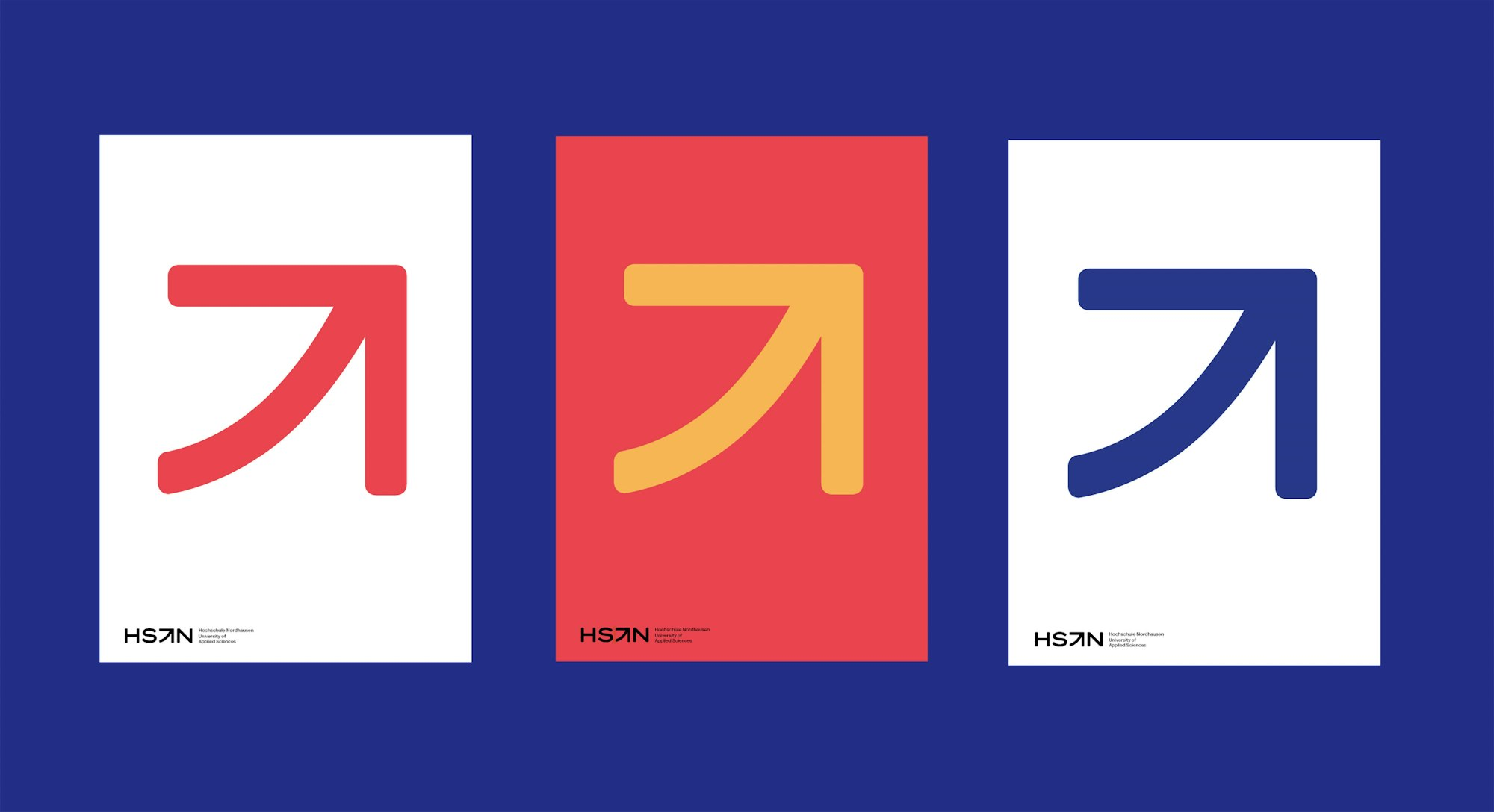
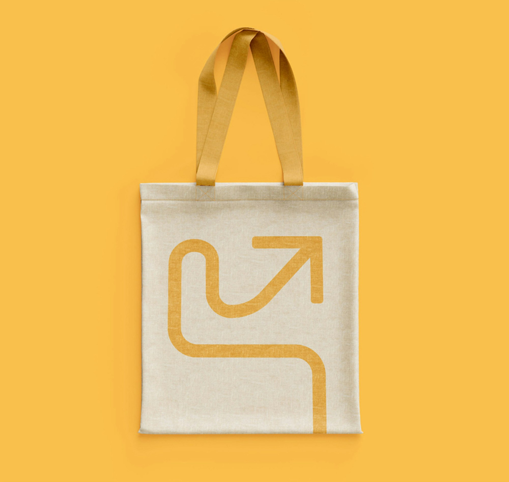
Arrow as differentiator for the new visual identity, integrated as intervention in the logo as well as dynamic key visual.
A varying logo combined with a vivid colour palette.
Logo variations
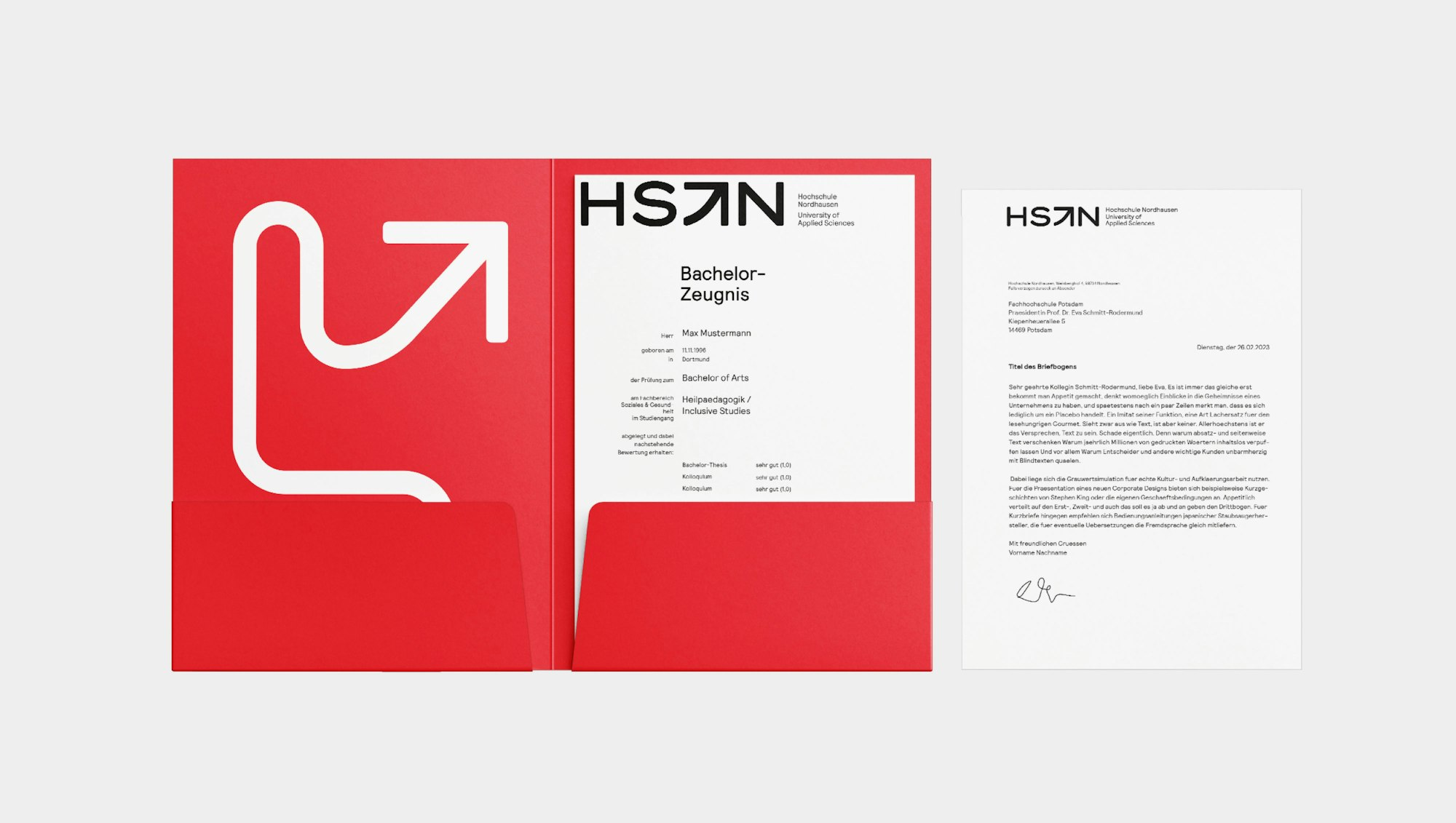
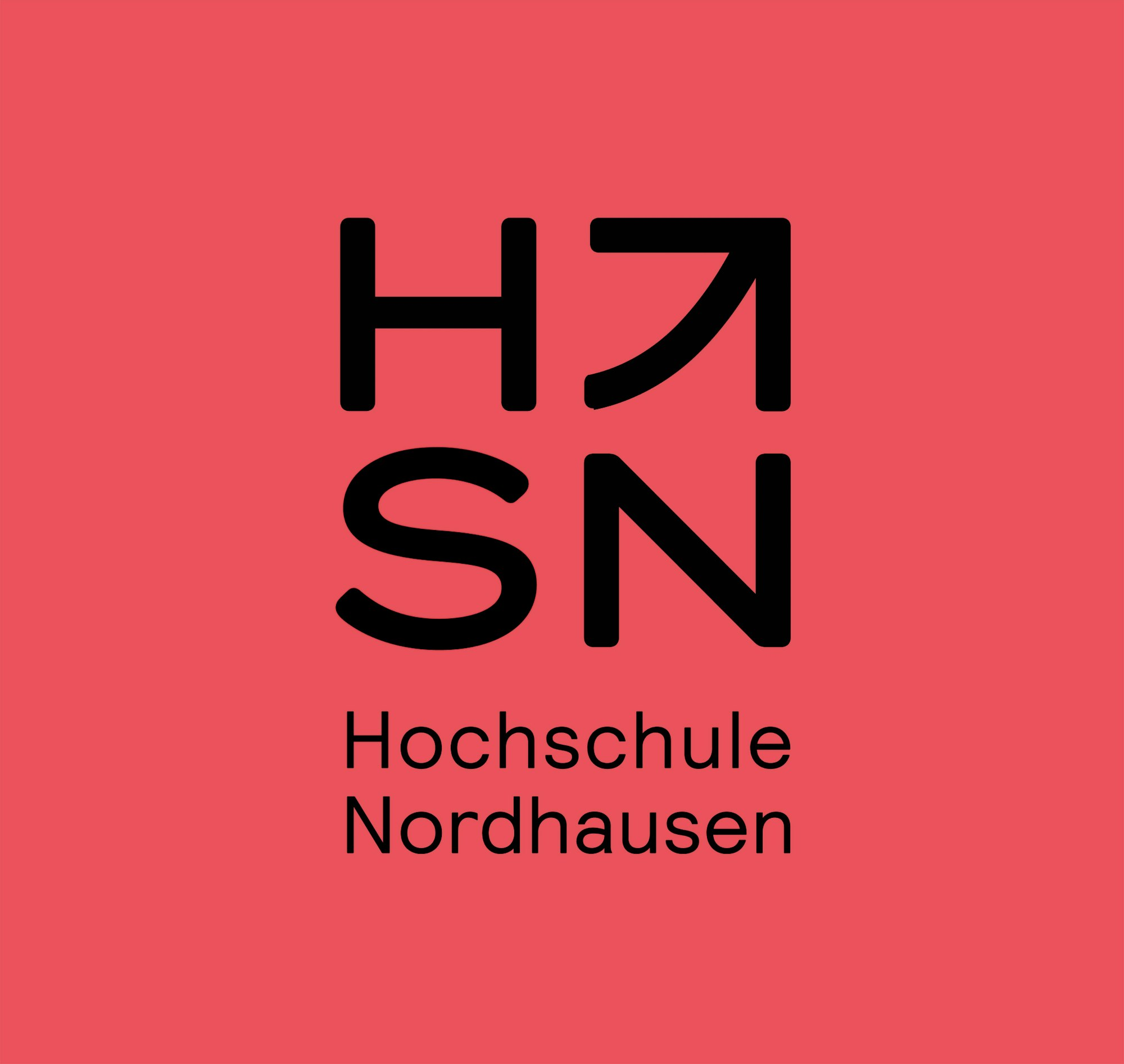
The redesigned logo introduces a dynamic arrow element between the abbreviated “HS” and “N” to symbolise orientation, progress, and campus life. A modular logo system was developed to unify the university and its associated research institutes under a cohesive visual identity. The custom arrow also informs a flexible key visual system, allowing for diverse but recognisable applications across media.
Vivid colours
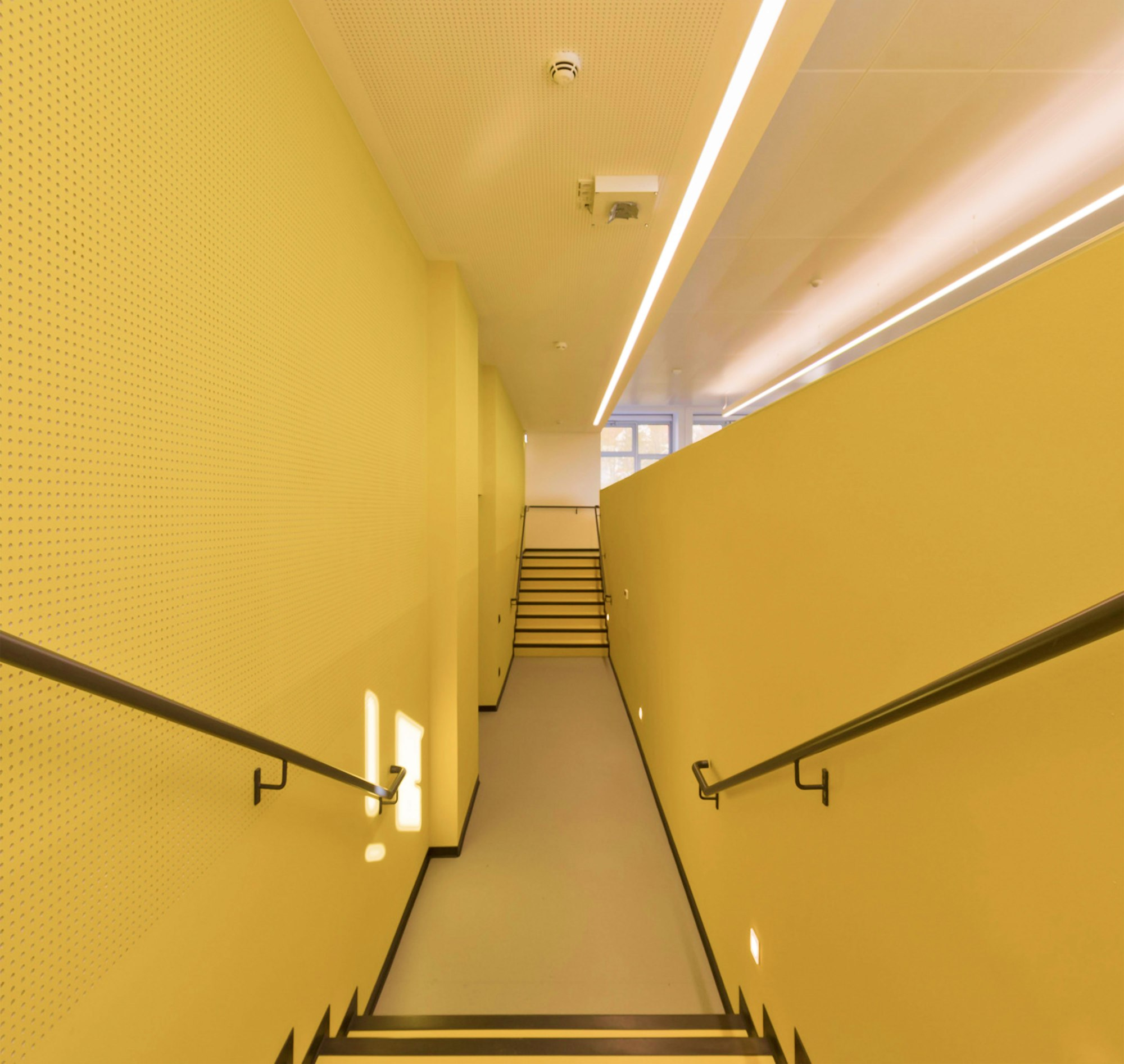
The color palette leverages a vivid adaptation of Thuringia’s red, complemented by deep blue and bright yellow, ensuring maximum contrast and visibility in both digital and print formats. These core design choices give Hochschule Nordhausen a bold and contemporary identity, significantly enhancing its visibility and appeal to prospective students.
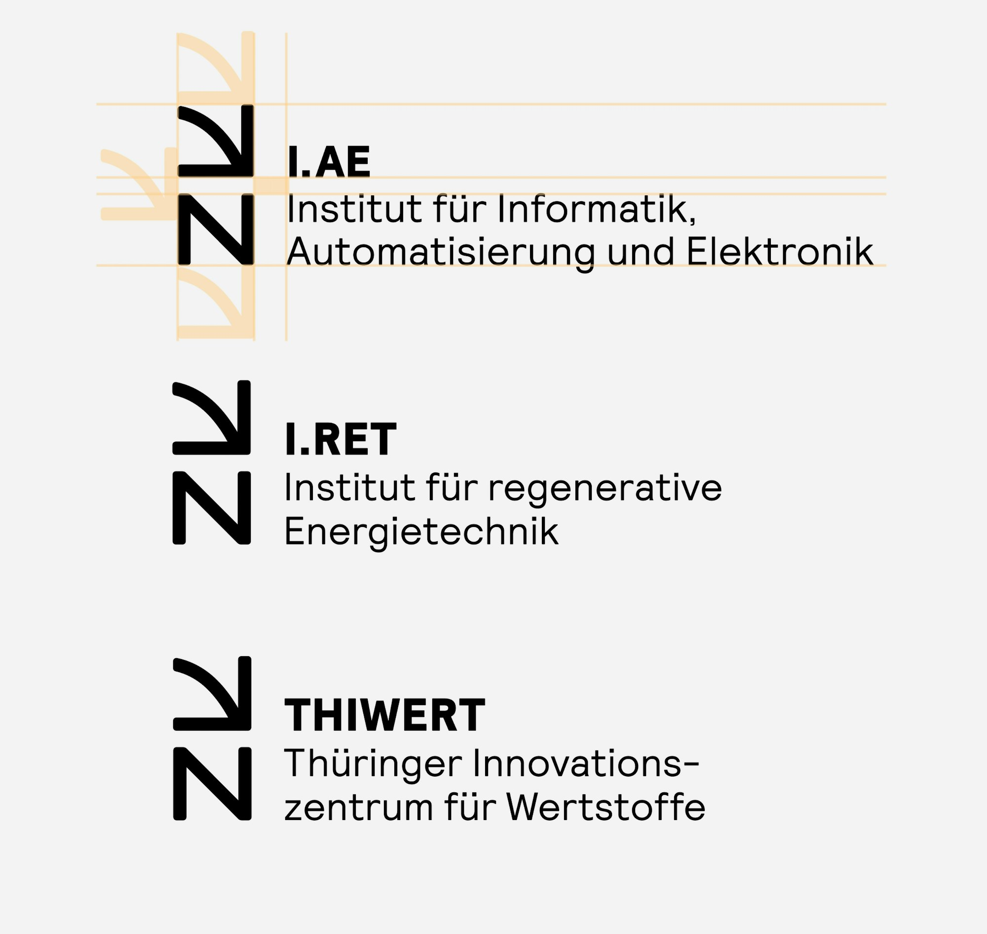
The square grid, deriving from the proportional nature of the letters, allows the construction of a varying key visual.
The dynamic qualities of the university were embodied through a custom arrow symbol representing orientation and movement, supported by a bold new color palette and a modular logo system that ensures strong brand recognition across diverse communication channels.
