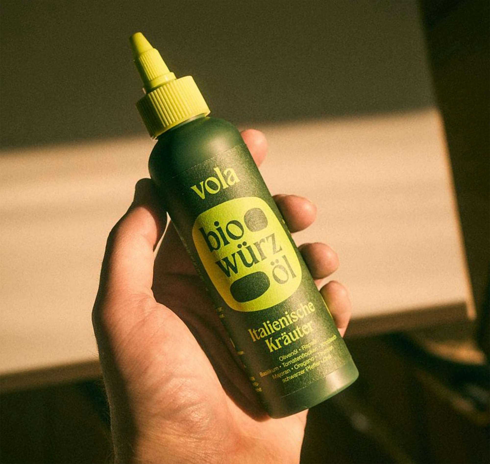
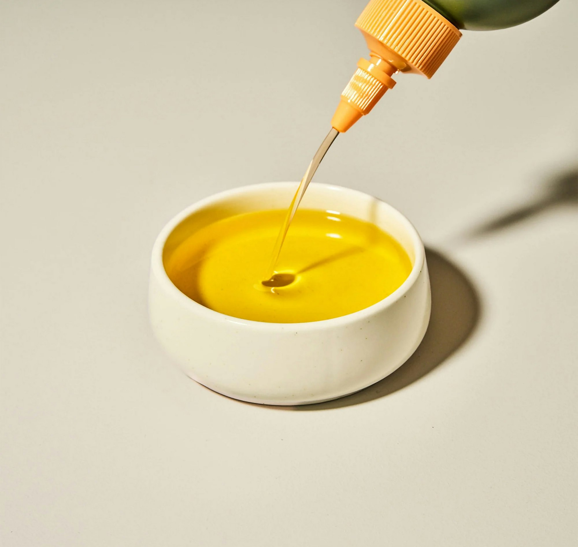
vola is a German start-up specializing in high-quality oils and seasoning oils, packaged in innovative squeeze bottles.
With a strong focus on sustainability, regional sourcing, and organic production, vola rethinks traditional oil consumption and stands out through a combination of premium quality, cold-press extraction, and an innovative approach to packaging.
vola's product range includes two distinct categories – base oils and spice oils.
Product range: base oils and spice oils
Base oils are filled in 500ml easy-to-squeeze bottles and include pure olive oils and blends of two different oils (cuvées). The second category consists of spice oils. Thanks to the specially developed and unique Spice2Oil process, these oils are enriched with natural spices.
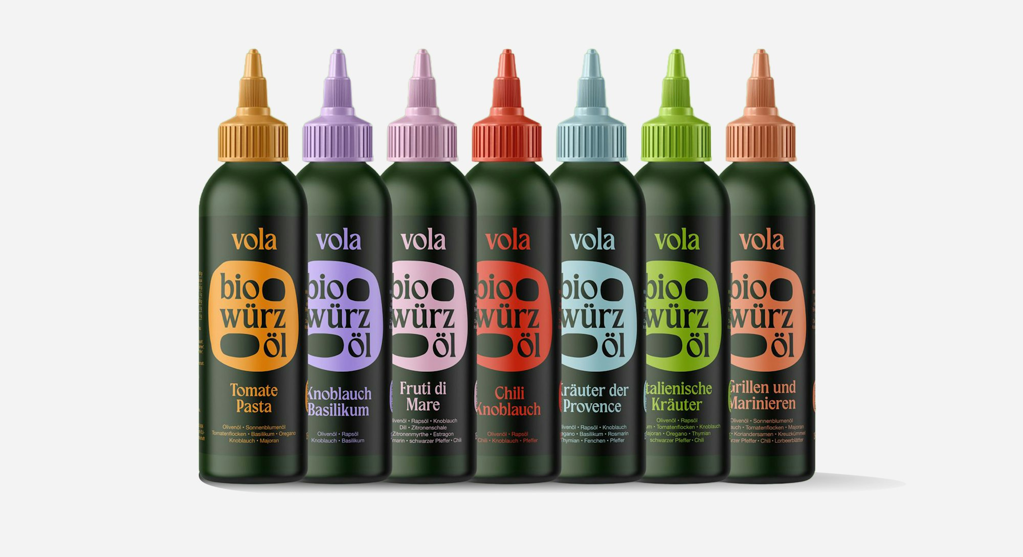
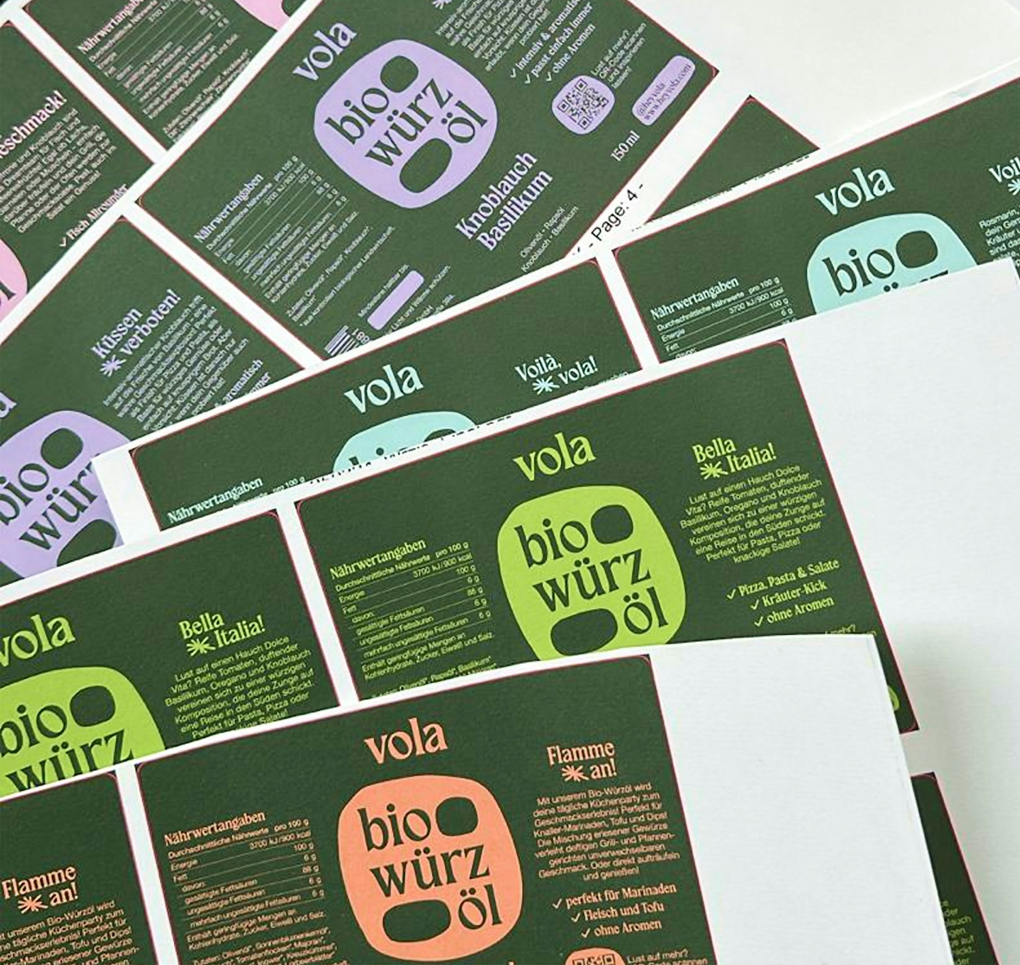
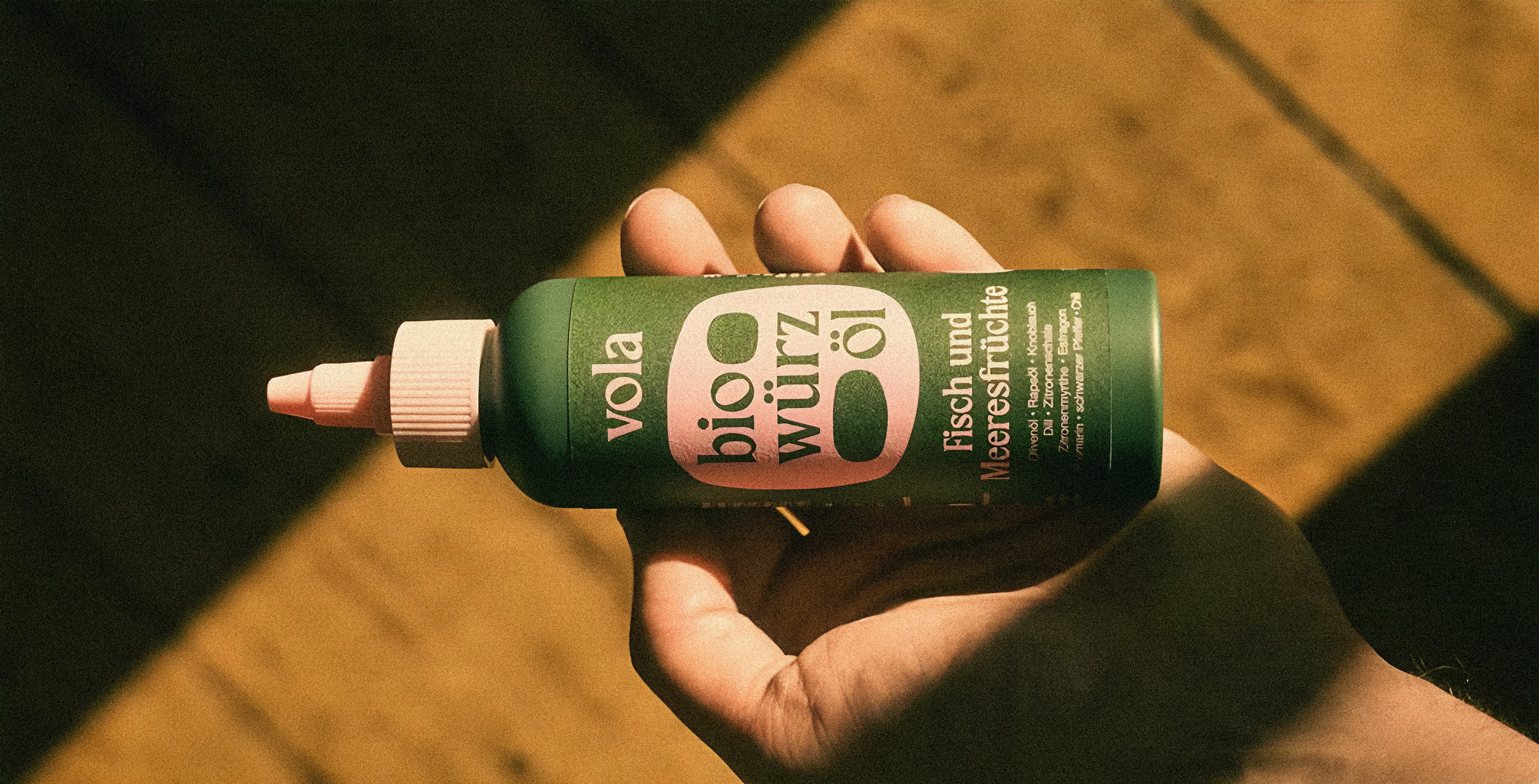
vola's product range of different spice oil flavours with the new design.
To move vola away from its initial visual reference and build a strong, independent identity, the design approach focused on refining the visual language.
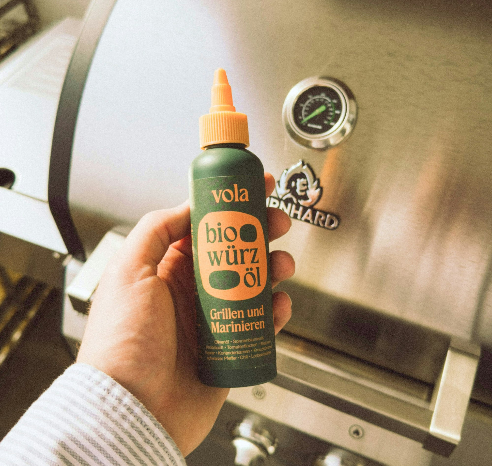
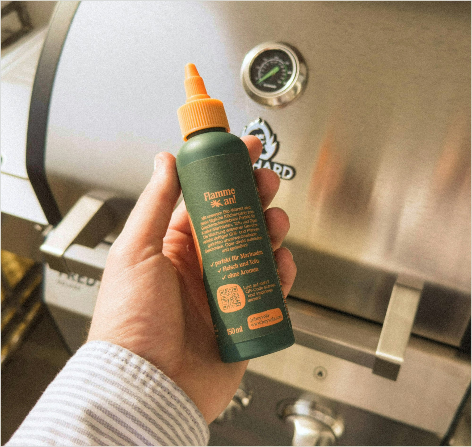
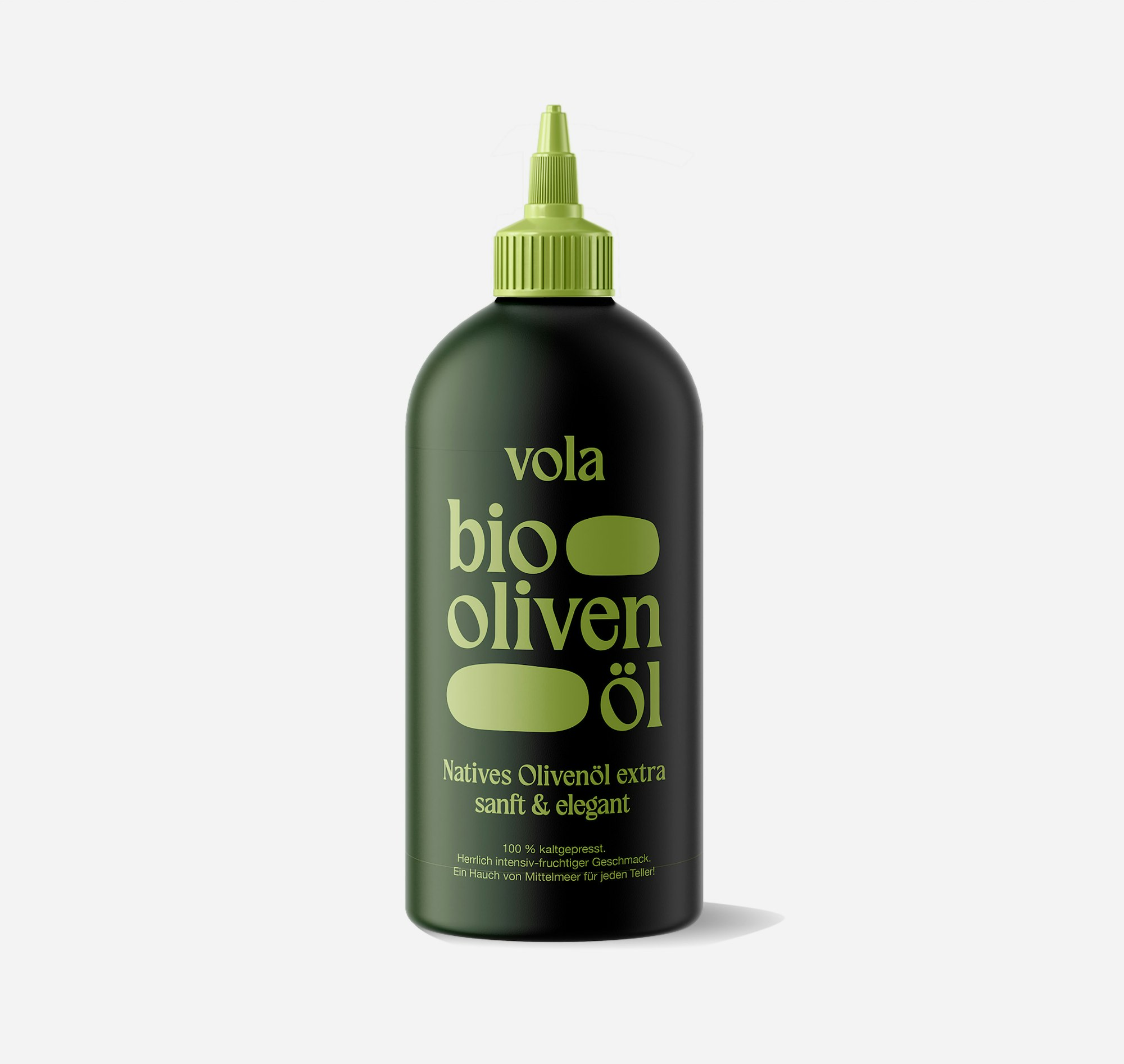
Clarity, product differentiation and authenticity was prioritised by reworking the packaging typography, implementing a direct-to-bottle printing technique, and developing a consistent, modular system for product naming and design elements.
Restructured typography
The typography system was restructured using Helvetica for body text to align with food industry standards and regulatory requirements, while the Agerola typeface was introduced as a distinctive display font to strengthen brand identity.
Direct printing on bottles
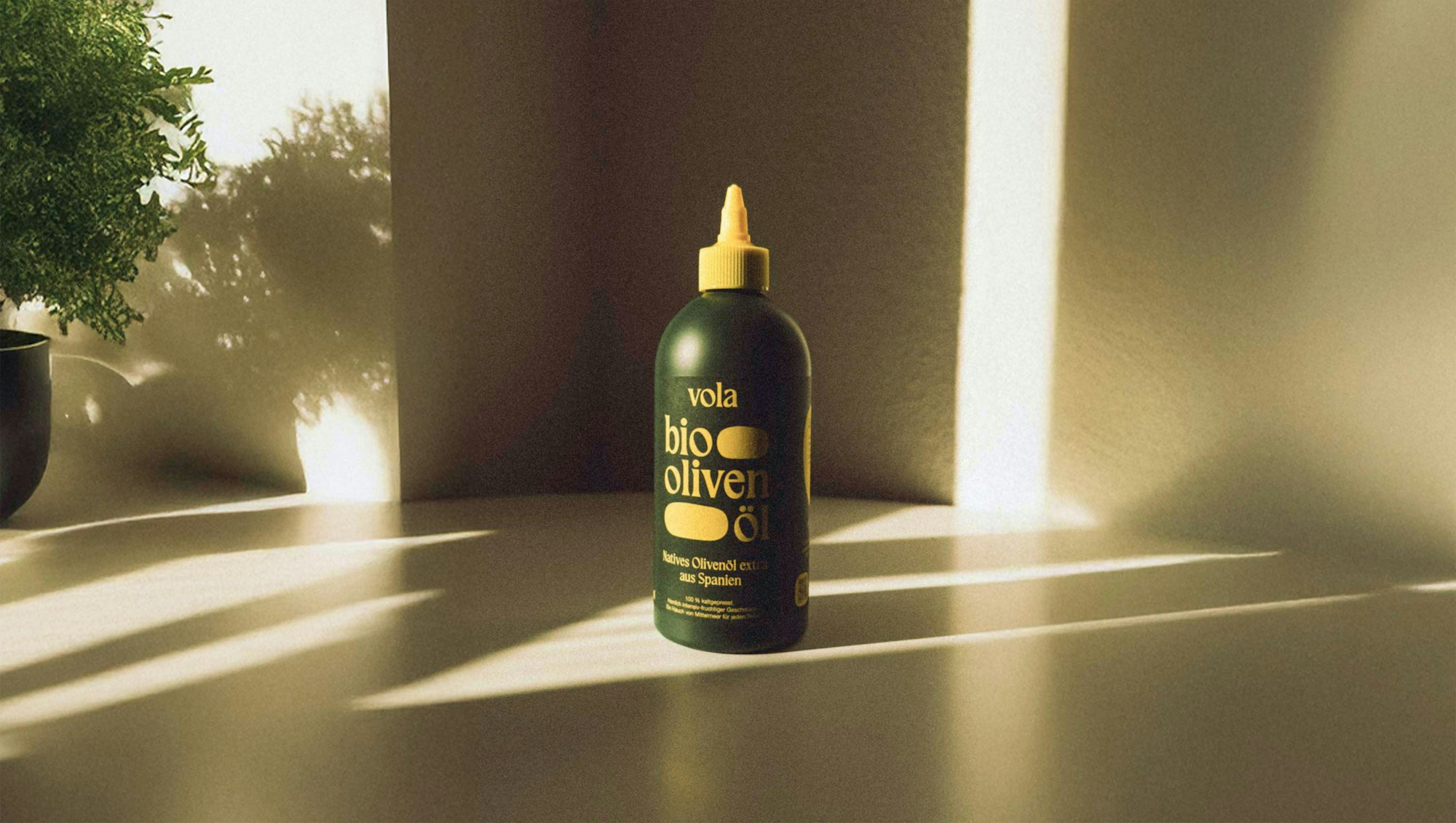
Direct printing on R-PET bottles was implemented to improve durability and reduce visual wear over time. The packaging design follows a modular grid, organizing product names with a new systematic logic around the terms "bio" and "oil," enhancing brand consistency and readability.
Removal of mascot illustrations
The removal of illustrations and the introduction of organic shapes within the typography layout elevate the perception of product quality and sustainability, positioning vola with a more sophisticated and authentic presence on the market.
