MOSIDI is an open-source web application to make municipal data more accessible and actionable.
By merging open and internal datasets — from demographic trends to climate data — the platform empowers users to visualize, analyze, and share insights, supporting better decision-making processes across sectors.
Scope
The design task consisted of the development of a new visual identity, designing a landing page to advertise the product as well as new UX / UX concept for the interactive data visualisation platform itself.

A flexible design system built around modular geometric forms represents the combination and personalisation of diverse datasets providing a broad of visuals.
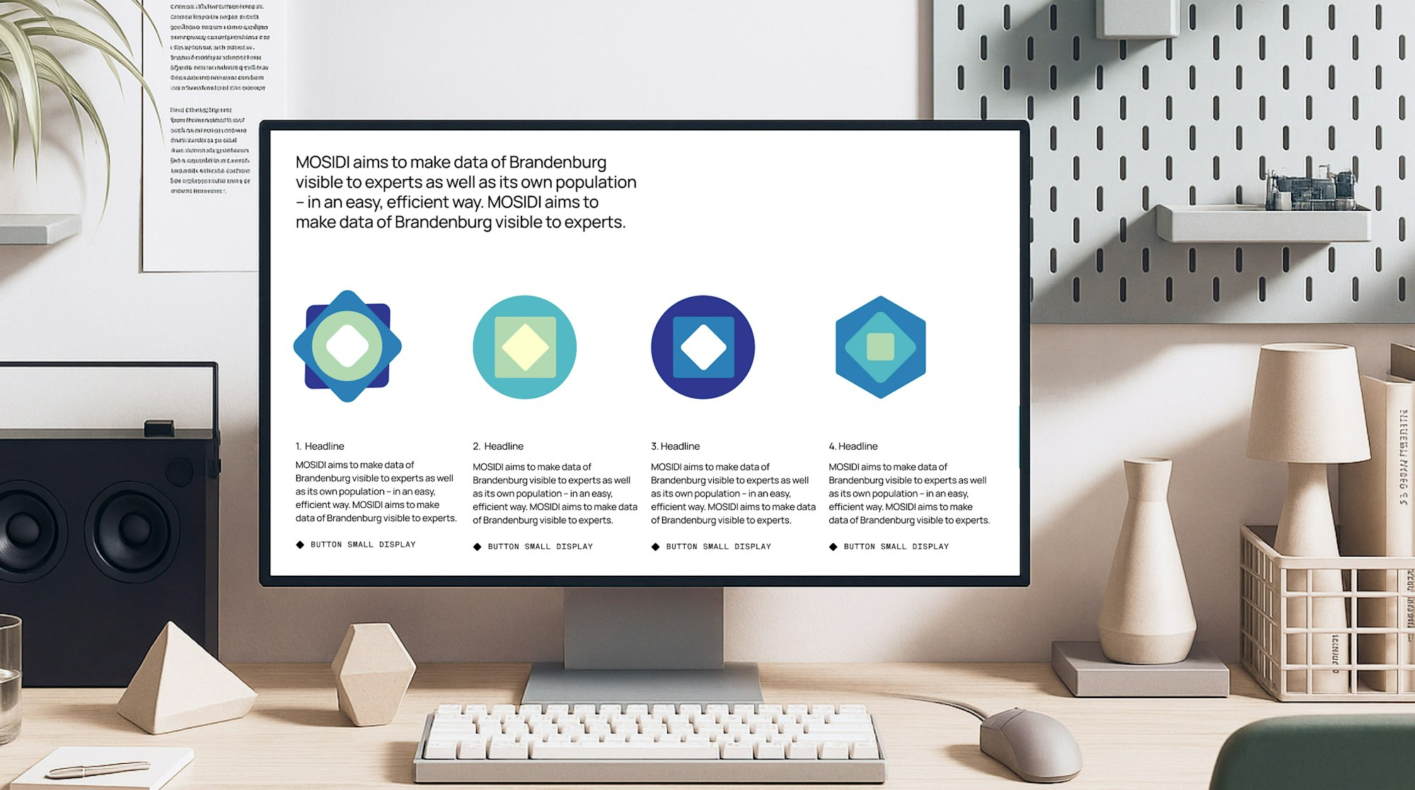
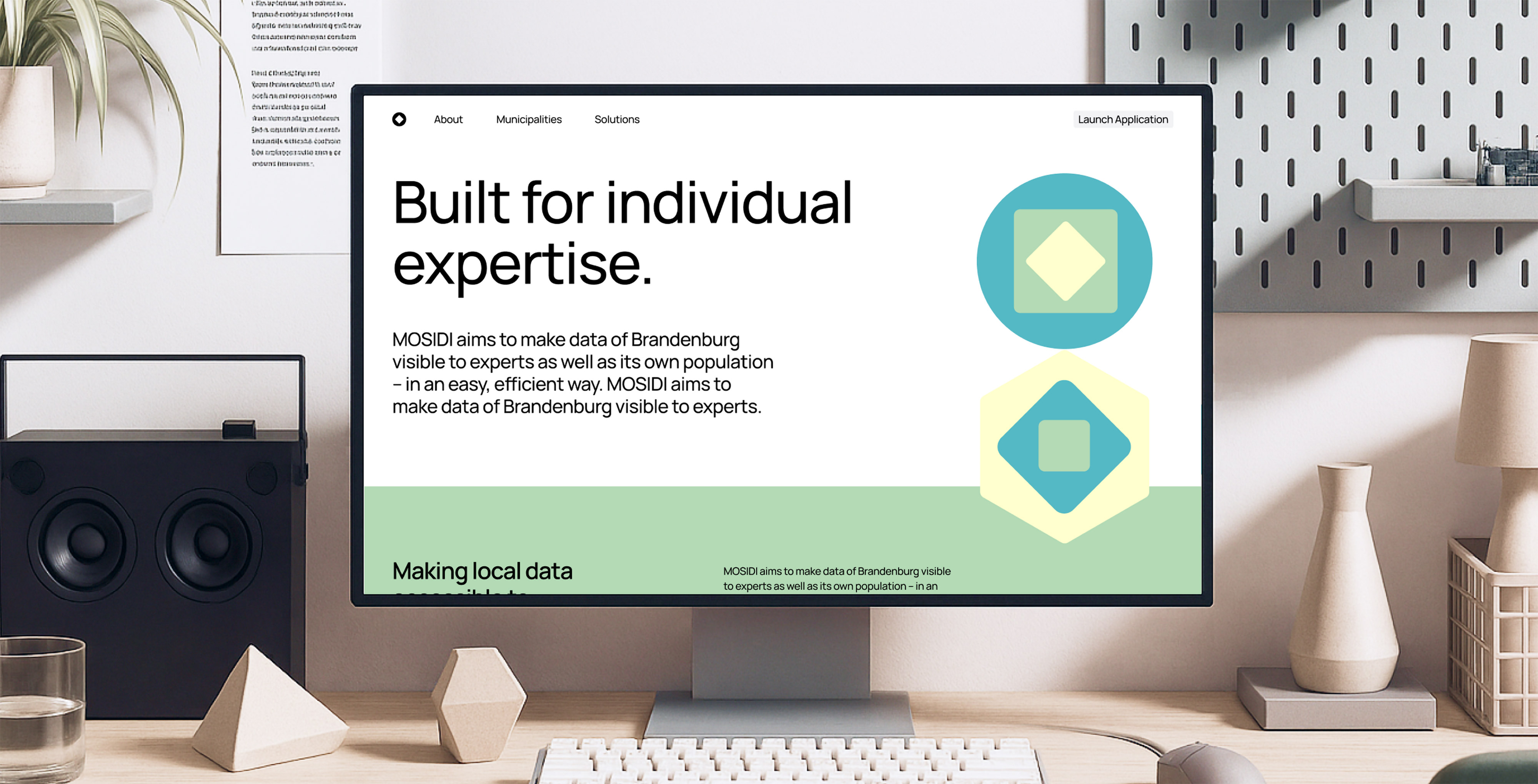
Website for MOSIDI showing dynamic identity offering shape variations.

Different basic shapes represent various data types such as points, polygons, and lines.
Visual identity
A flexible design system built around modular geometric forms represents the combination and personalisation of diverse datasets providing a broad of visuals. Restricting the system to three foundational forms ensures recognizability while allowing for the creation of complex, meaningful visual combinations.
UI / UX
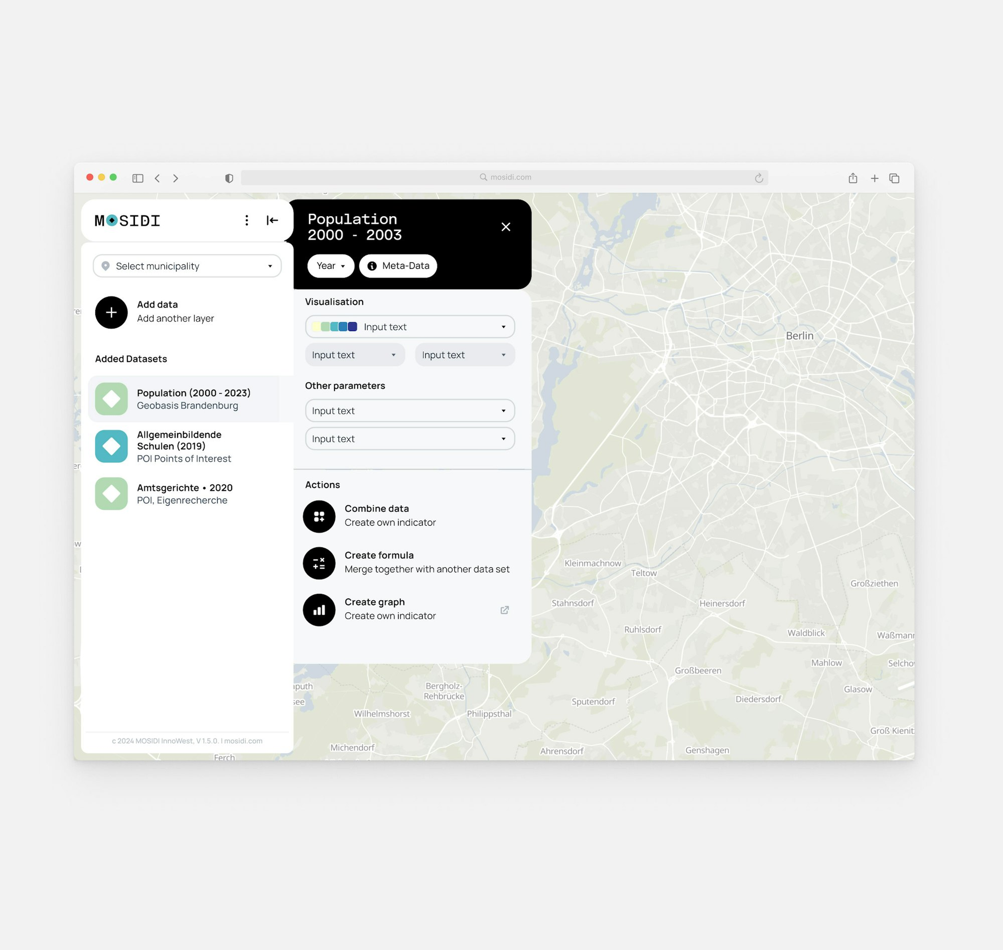
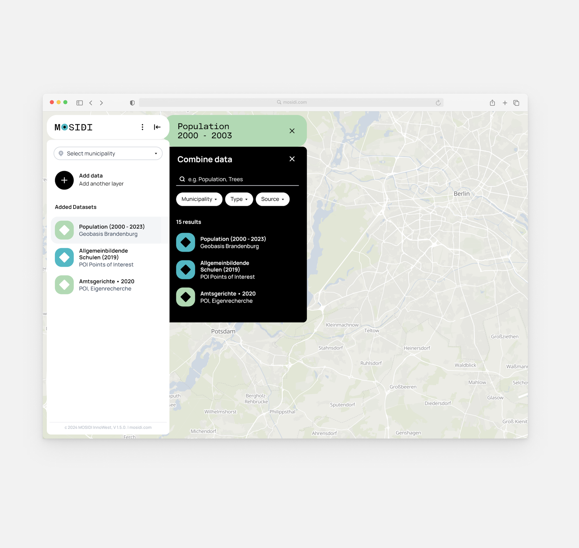
Based on a first prototype, the UX and UI of the map-based application was fundamentally changed to simplify the overall navigation for a broader target group without knowledge of data analysis. Reducing complexity and adding explanatory layers for specific functions help making the platform accessible and easy-to-use for everyone.
